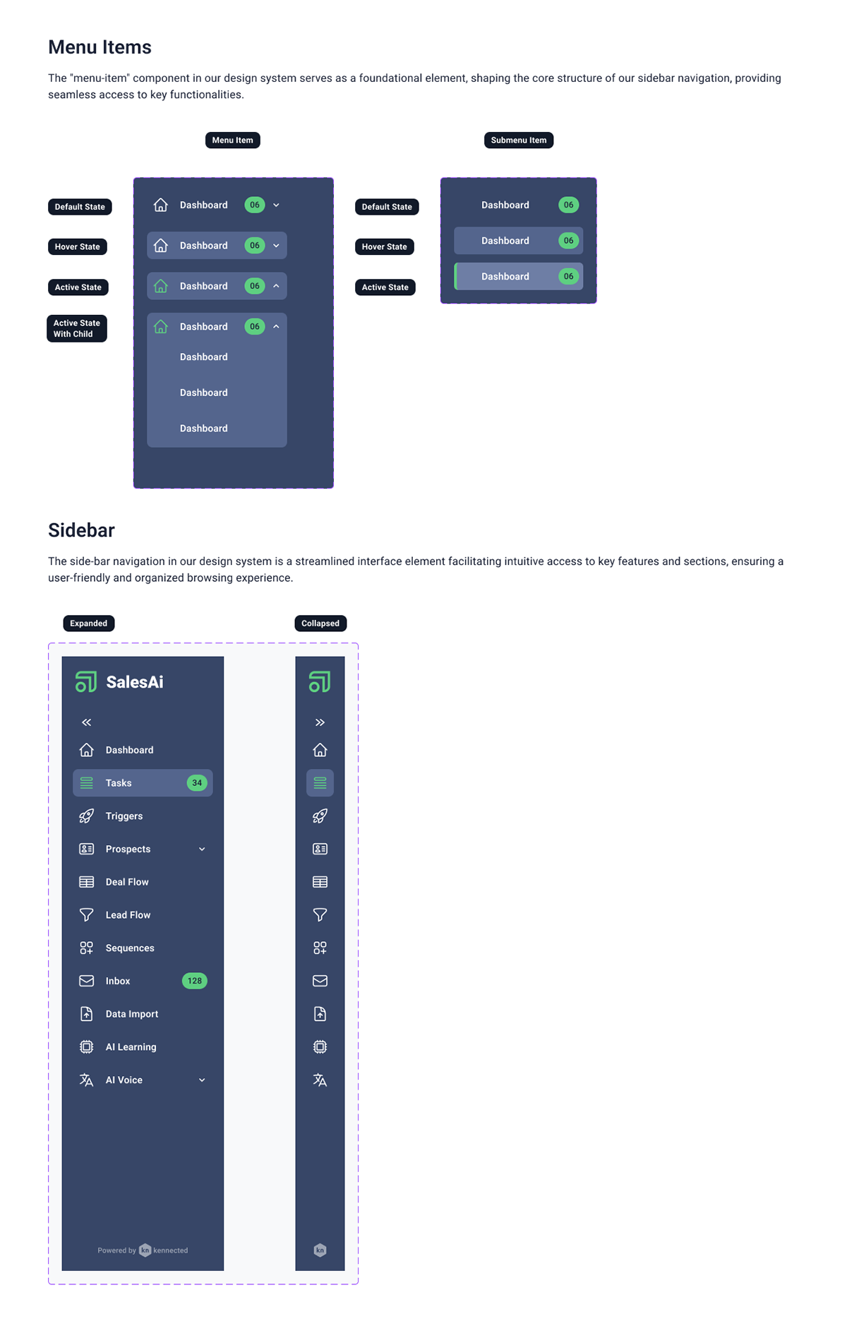
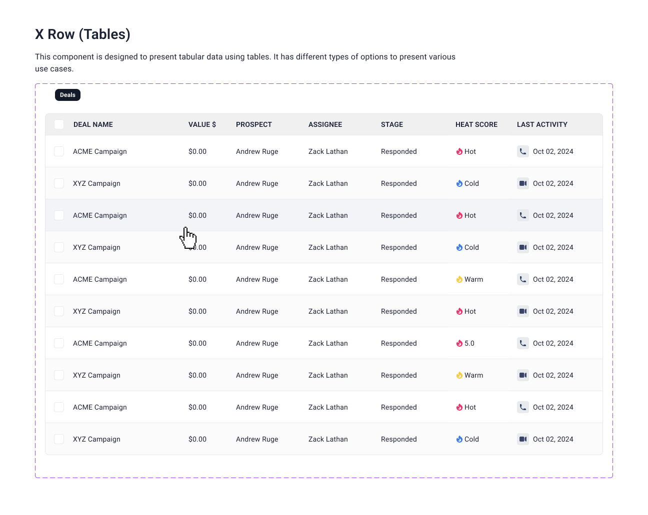
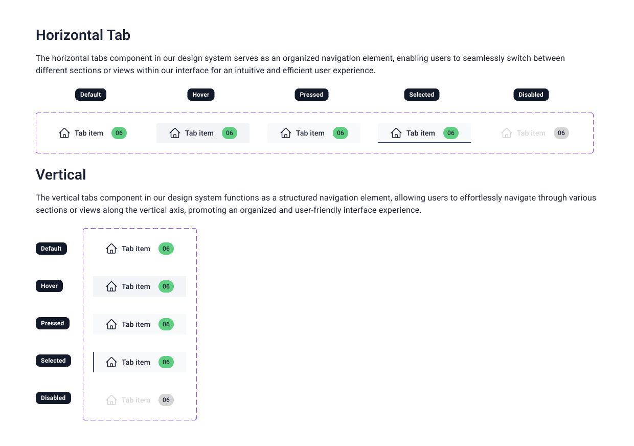
The SalesAI Design System involved the end-to-end creation of a cohesive, scalable visual language tailored for a product evolving at high speed. I structured the entire system using Atomic Design methodology, ensuring every component from foundational tokens to complex templates, was consistent, modular, and easy for teams to adopt. Throughout the process, accessibility served as the primary guiding principle, shaping decisions around typography, spacing, motion, and interaction patterns so the system could support inclusive, barrier-free user experiences.
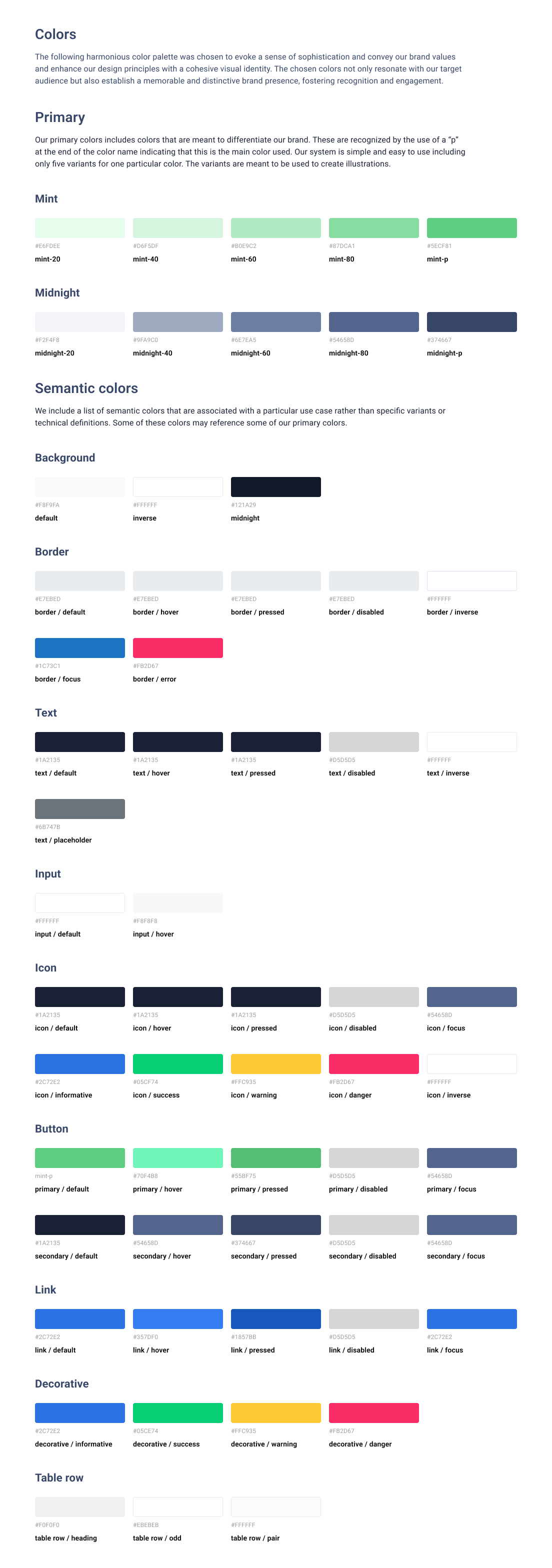
A major part of the project focused on redefining the brand’s visual identity for digital environments. The original bright lime green, while distinctive, presented contrast and legibility challenges on the web. I expanded and refined the palette into a more accessible set of tones, preserving the brand’s energetic personality while enhancing usability across UI surfaces. This new palette, combined with a structured component library and clear documentation, established a future-proof design system that supports both brand expression and product clarity at scale.
Click a thumbnail to see the larger image.